Component: wn_matrix
Description
This component was designed to be used in the BBC Academy Wood Norton BNCS Installation. It simplifies the
management of the source or destination of the primary matricies that has multiple pages of sources.
An example of the component, with selected matrix instance, is shown below.
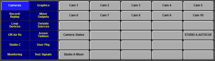
The blue buttons are the group page controls. Selecting one of the group buttons causes the associated set of sources to be shown on
the grey buttons. The colours used for the group buttons can be changed by sending stylesheet names to the control.
The source selector grey buttons also have two stylesheets that control the unselected and selected button appearance.
There is a dark grey background around the the outside of the buttons in the above example. The colour of the background is adjustable
by sending a QT colour string to the component.
The component has three native sizes available - 875 x 250, 975 x 250, and 1175 x 280 (sizes in pels). The user can set the target panel size to select the best version on the panel size they are using.
Commands
You can pass commands to this component in the format:
<parameter>=<button_id>
| Name |
Type |
Use |
| instance |
Name String |
The name of the Instance to use for this selection set. |
| host_size |
Number |
The target host panel size for 1:1 presentation of the component. The supported values are 900, 1024, and 1280. |
| pageoffset |
Number |
The ?? |
| mapdb |
Number |
The database to use for mapping of the buttons. Default is database eight. |
| mapoffset |
Number |
Offset that is added to the page number for button mapping. |
| groupmapoffset |
Number |
Offset added to the group page number for for button mapping. Although the page number is fixed at 1, setting the
offset allows the user to select any total offset in the mapping database. |
| namesdb |
Number |
Database used to get button names. Default is 0 (sources). |
| stylesheet.group.selected |
Name String |
Set the stylesheet name to use for the active button of the group selection buttons. |
| stylesheet.group.deselected |
Name String |
Set the stylesheet name to use for the inactive button of the group selection buttons. |
| stylesheet.item.selected |
Name String |
Set the stylesheet name to use for the selected item of the item selection buttons. |
| stylesheet.item.deselected |
Name String |
Set the stylesheet name to use for the deselected item of the item selection buttons. |
| colour.background |
QT colour string |
Set the colour of the background box. |
| select |
Number |
The index of the button to highlight. A value of -1 should be sent to de=select all highlights. |
Notifications
| Name |
Use |
| index=<button_id> |
The index of the active button, or -1 for no button selected. |
Stylesheets
| Name |
Use |
| WN_XYbuttons |
Basic style for both group and item selection grids. |
| source_selected |
Button selected style for both group and item selection grids. This style is normally overridden by the component settings. |
| source_deselected |
Button deselected style for both group and item selection grids. This style is normally overridden by the component settings. |
| WNGroupSelected |
Style used for selected button on the group select panel. Can override style in component property settings. |
| WNGroupDeselected |
Style used for unselected buttons on the group select panel. Can override style in component property settings. |
| WNSourceSelected |
Style used for selected button on the item select panel. Can override style in component property settings. |
| WNSourceDeselected |
Style used for deselected buttons on the item select panel. Can override style in component property settings. |
Developers Notes
Select the target size that best matches the space available on your target panel.
Andy Woodhouse, BBC Academy
|